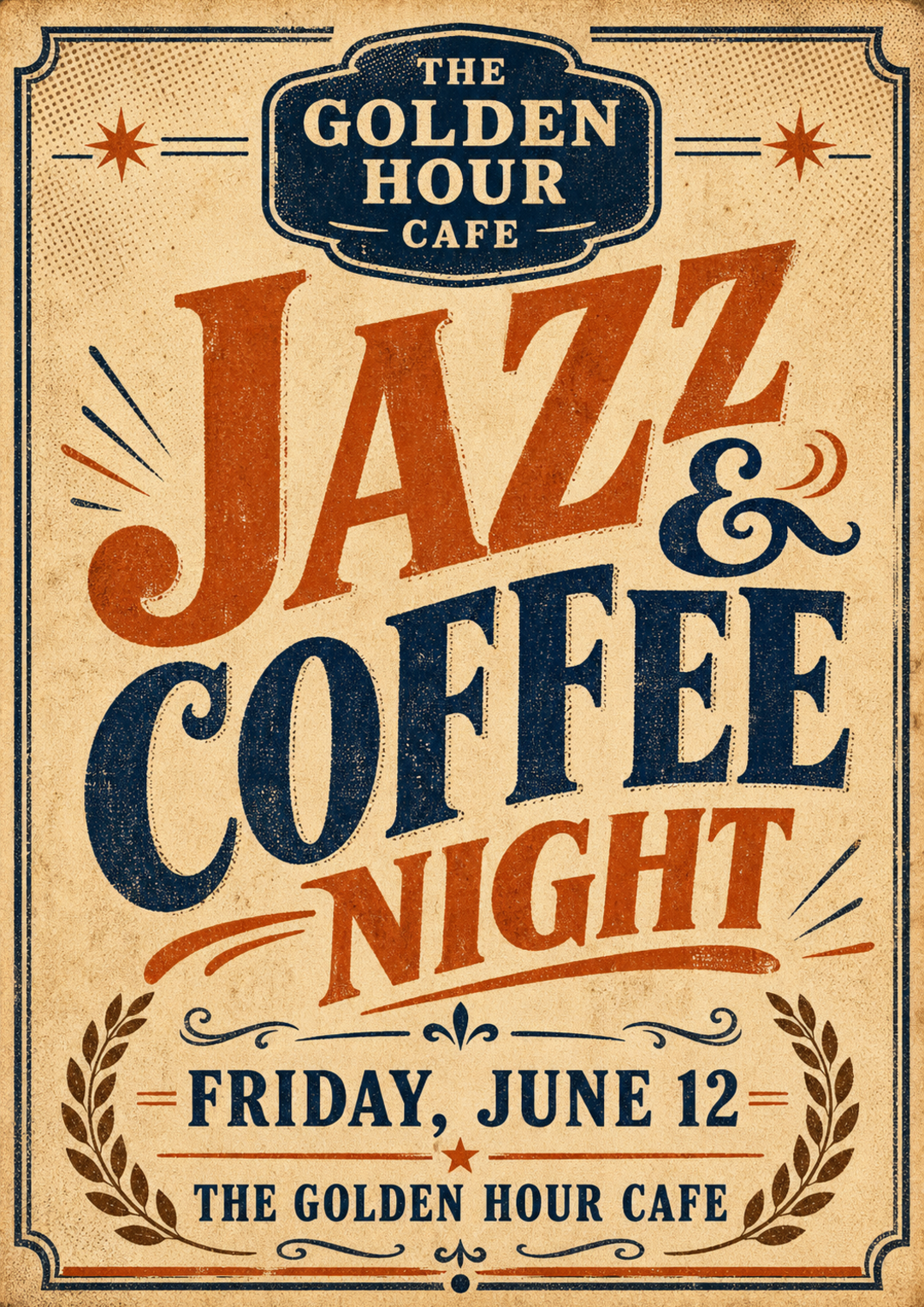
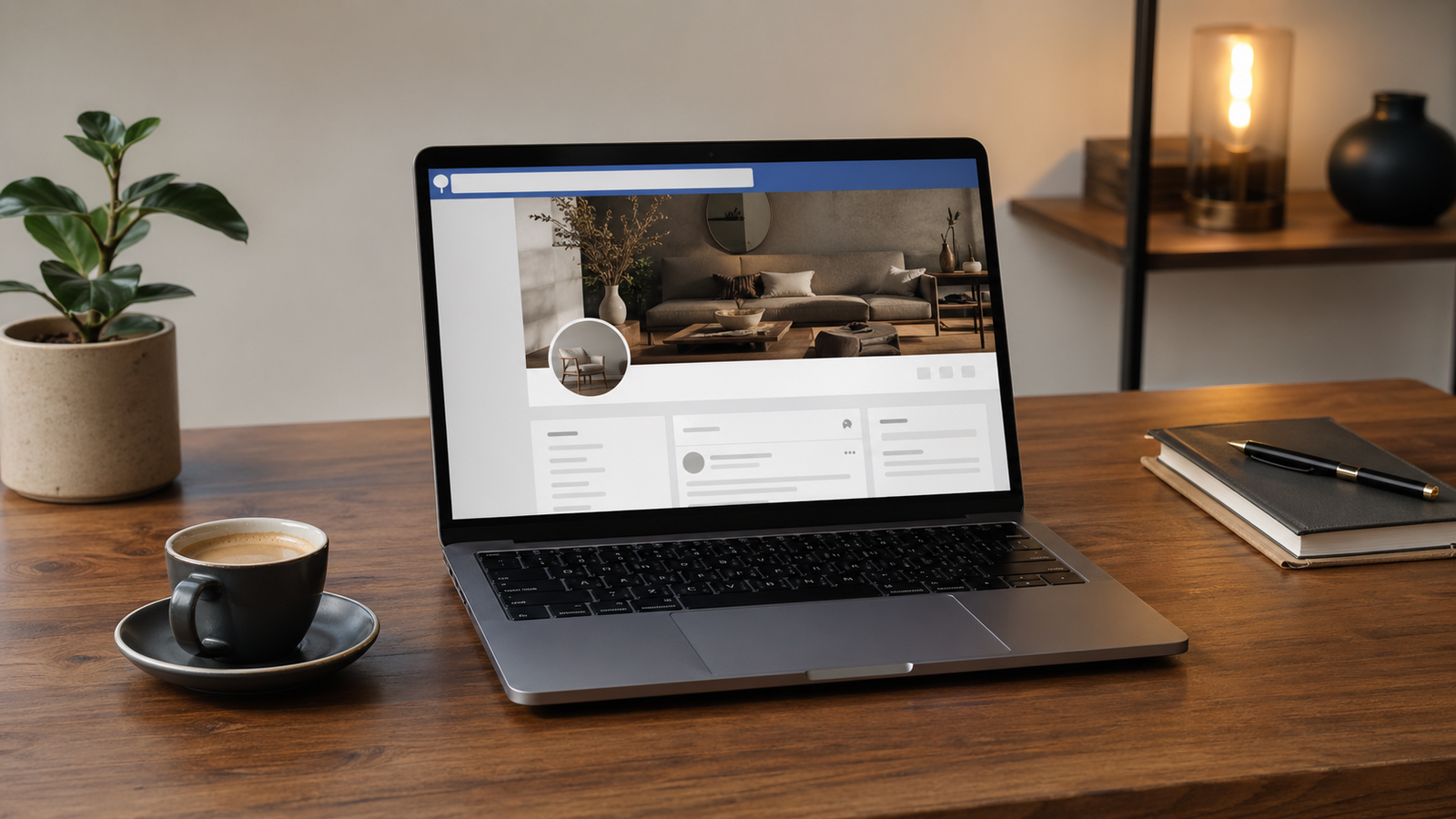
สร้าง Facebook Page Banner สื่อตัวตนธุรกิจในภาพเดียว
ออกแบบ Facebook Cover Photo ที่สื่อ brand identity และ value proposition ของธุรกิจได้ในภาพเดียว ด้วย prompt ที่ระบุโทนสี กลุ่มลูกค้า และข้อจำกัดเฉพาะของ Facebook เช่น ตำแหน่ง profile photo ไม่ต้องจ้างนักออกแบบเพื่อได้ banner คุณภาพมืออาชีพ
คัดลอกพรอมต์ฉบับมีตัวแปร {{...}} ไปแก้ไขในเครื่องมือของคุณเอง
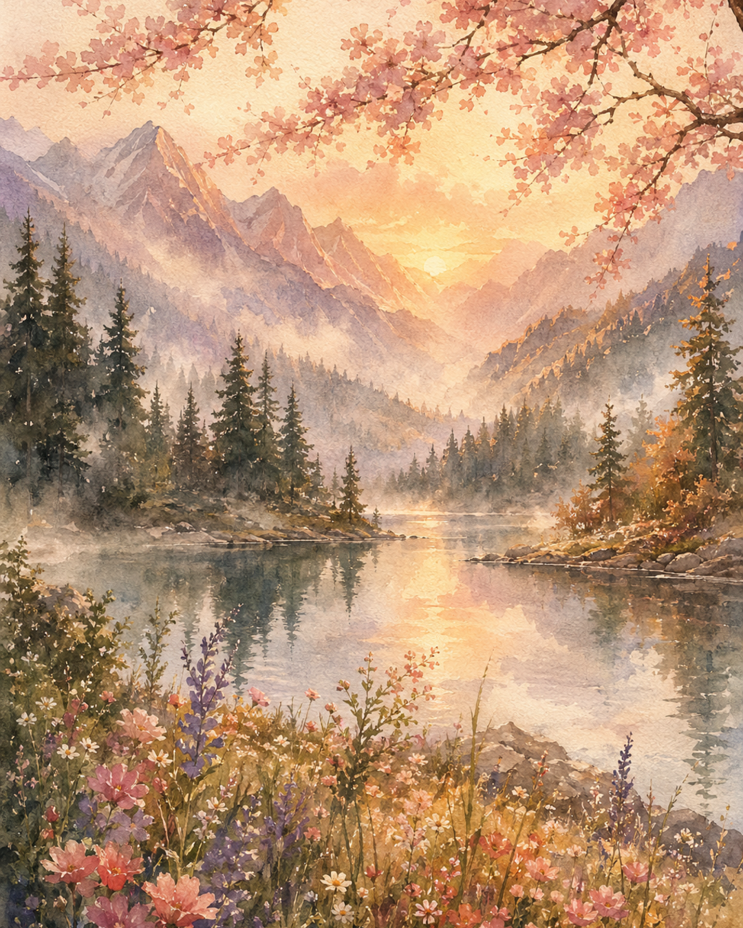
ตัวอย่างผลลัพธ์ที่จะได้
ก่อนเริ่มลงมือปรับพรอมต์ ดูตัวอย่างผลลัพธ์ที่คุณจะได้จริงเพื่อให้แน่ใจว่าพรอมต์นี้ตรงกับงานที่ต้องการ
ปรับให้เข้ากับงานของคุณ
แก้ค่าตัวแปรด้านล่าง พรอมต์ฉบับสมบูรณ์จะอัปเดตอัตโนมัติ พร้อมคัดลอกไปวางใน Claude หรือ ChatGPT ได้ทันที
ระบุประเภทหรืออุตสาหกรรมของธุรกิจ เช่น ร้านอาหาร, สปา, บริษัท IT, ร้านเสื้อผ้า
ชื่อแบรนด์หรือชื่อร้านของคุณ
ประโยคสั้นที่บอกว่าธุรกิจของคุณมอบอะไรให้ลูกค้า และทำไมถึงต่างจากคู่แข่ง
บรรยายลูกค้าเป้าหมายสั้นๆ เช่น อายุ อาชีพ ไลฟ์สไตล์
บรรยายสไตล์ภาพที่ต้องการ เช่น สดใส energetic, หรูหรา premium, เป็นกันเอง friendly, ทันสมัย tech
ชื่อสีหรือโทนสีของแบรนด์ อาจระบุ hex code ด้วยก็ได้ เช่น สีน้ำเงิน Navy #1A2E5C
Business name: The Daily Grind
Core value proposition: กาแฟ specialty ที่ทำให้ทุกเช้ารู้สึกพิเศษ
Target audience: วัยทำงานรุ่นใหม่ที่รักกาแฟคุณภาพ
Visual style: อบอุ่น เรียบหรู minimalist
Brand color palette: น้ำตาลอบอุ่น, ครีม, ทอง
Design requirements:
- Wide landscape format suitable for Facebook cover (820×312 px aspect ratio)
- Visually communicate the brand identity and core promise through imagery alone — no text
- Show a scene or subject that reflects what คาเฟ่และร้านกาแฟ specialty delivers to วัยทำงานรุ่นใหม่ที่รักกาแฟคุณภาพ
- Use น้ำตาลอบอุ่น, ครีม, ทอง as the dominant color palette throughout the composition
- Keep the bottom-left area visually open and uncluttered (Facebook overlays the profile picture there on desktop and mobile)
- Photorealistic quality, professional finish, no clip art, no stock-photo feel
- No text, no typography, no logos, no watermarks in the image
เข้าใจเทคนิคที่ซ่อนอยู่
คลิกที่ส่วนไฮไลต์ในพรอมต์เพื่อกระโดดไปดูคำอธิบายเทคนิคแต่ละจุด ใช้ความเข้าใจนี้เพื่อปรับพรอมต์อื่นของคุณเองในภายหลัง
Business name: {{ชื่อธุรกิจ}}
Core value proposition: {{value_proposition}}
Target audience: {{กลุ่มลูกค้า}}
Visual style: {{โทนภาพ}}
Brand color palette: {{สีหลัก}}
Design requirements:
- Wide landscape format suitable for Facebook cover (820×312 px aspect ratio)5
- Visually communicate the brand identity and core promise through imagery alone — no text2
- Show a scene or subject that reflects what {{ประเภทธุรกิจ}} delivers to {{กลุ่มลูกค้า}}
- Use {{สีหลัก}} as the dominant color palette throughout the composition6
- Keep the bottom-left area visually open and uncluttered (Facebook overlays the profile picture there on desktop and mobile)4
- Photorealistic quality, professional finish, no clip art, no stock-photo feel
- No text, no typography, no logos, no watermarks in the image3
แตะส่วนที่ไฮไลต์เพื่อดูคำอธิบายเทคนิคแต่ละจุด · {{ }} คือตัวแปรที่ปรับได้
"Design a professional Facebook page cover photo for a {{ประเภทธุรกิจ}} business."
การเปิดด้วยคำกริยา 'Design' และคำว่า 'professional' บอก AI ชัดเจนว่าต้องทำหน้าที่เป็นนักออกแบบกราฟิกมืออาชีพ ไม่ใช่แค่สร้างภาพทั่วไป ทำให้ผลลัพธ์มีมาตรฐานการออกแบบที่สูงขึ้น
"Visually communicate the brand identity and core promise through imagery alone — no text"
บังคับให้ AI ถ่ายทอด value proposition ผ่านองค์ประกอบภาพแทนตัวอักษร ซึ่งแก้ปัญหาที่ AI มักสร้างตัวหนังสือผิดเพี้ยนใน image generation และทำให้ภาพสื่อความหมายได้อย่างสง่างามยิ่งขึ้น
"No text, no typography, no logos, no watermarks in the image"
การระบุข้อห้ามซ้ำในหลายรูปแบบช่วยลดโอกาสที่ AI จะใส่ตัวอักษรเสียหายลงในภาพ ซึ่งเป็นปัญหาที่พบบ่อยที่สุดใน AI image generation และทำให้ banner ดูไม่เป็นมืออาชีพ
"Keep the bottom-left area visually open and uncluttered (Facebook overlays the profile picture there on desktop and mobile)"
การรู้ UX ของ Facebook ว่า profile photo ทับมุมล่างซ้าย แล้วระบุลงใน prompt ทำให้ banner ที่ได้ใช้งานได้จริงทันทีโดยไม่ต้องแก้ไขทีหลัง นี่คือความรู้เฉพาะ domain ที่ทำให้ prompt ดีกว่าคนทั่วไป
"Wide landscape format suitable for Facebook cover (820×312 px aspect ratio)"
การระบุ aspect ratio ที่ชัดเจนทำให้ AI รู้สัดส่วนภาพที่ต้องการ ซึ่งส่งผลโดยตรงต่อการจัดวาง focal point และ composition ให้เหมาะสมกับ platform จริง
"Use {{สีหลัก}} as the dominant color palette throughout the composition"
การผูกสีเข้ากับตัวแปรของแบรนด์จริงทำให้ภาพที่ได้มีความสอดคล้องกับ brand identity แทนที่จะให้ AI เลือกสีตามอำเภอใจ ซึ่งสำคัญมากสำหรับความจดจำแบรนด์
เห็นความต่างระหว่างพรอมต์ทั่วไปกับพรอมต์ที่ใช้เทคนิค
คนส่วนใหญ่เริ่มต้นด้วยคำสั่งสั้น ๆ แบบพรอมต์ที่ใช้กันทั่วไป แต่ผลลัพธ์มักไม่ตรงใจและต้องถามซ้ำหลายรอบ พรอมต์แบบที่ใช้เทคนิคข้างต้นช่วยแก้ปัญหานี้
ทำ banner Facebook ให้คาเฟ่ฉันหน่อย
ระบุขนาด 820×312 px และ aspect ratio, กำหนด value proposition ชัดเจน, บอกโทนสีแบรนด์, ห้ามมี text/logo, คำนึง profile photo placement มุมล่างซ้าย, บอกกลุ่มลูกค้าเพื่อเลือก imagery ที่เหมาะสม