สร้างโปสเตอร์อีเวนต์สไตล์ Retro Vintage สำหรับแบรนด์
สร้างโปสเตอร์อีเวนต์สไตล์ retro vintage ที่มีความเป็นยุคสมัยชัดเจน ด้วยพรอมต์ที่ระบุ era, color palette, texture และ layout hierarchy ให้ AI สร้างภาพที่ใช้งานได้จริงในงานการตลาด
คัดลอกพรอมต์ฉบับมีตัวแปร {{...}} ไปแก้ไขในเครื่องมือของคุณเอง
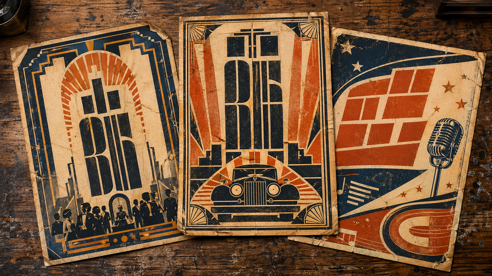
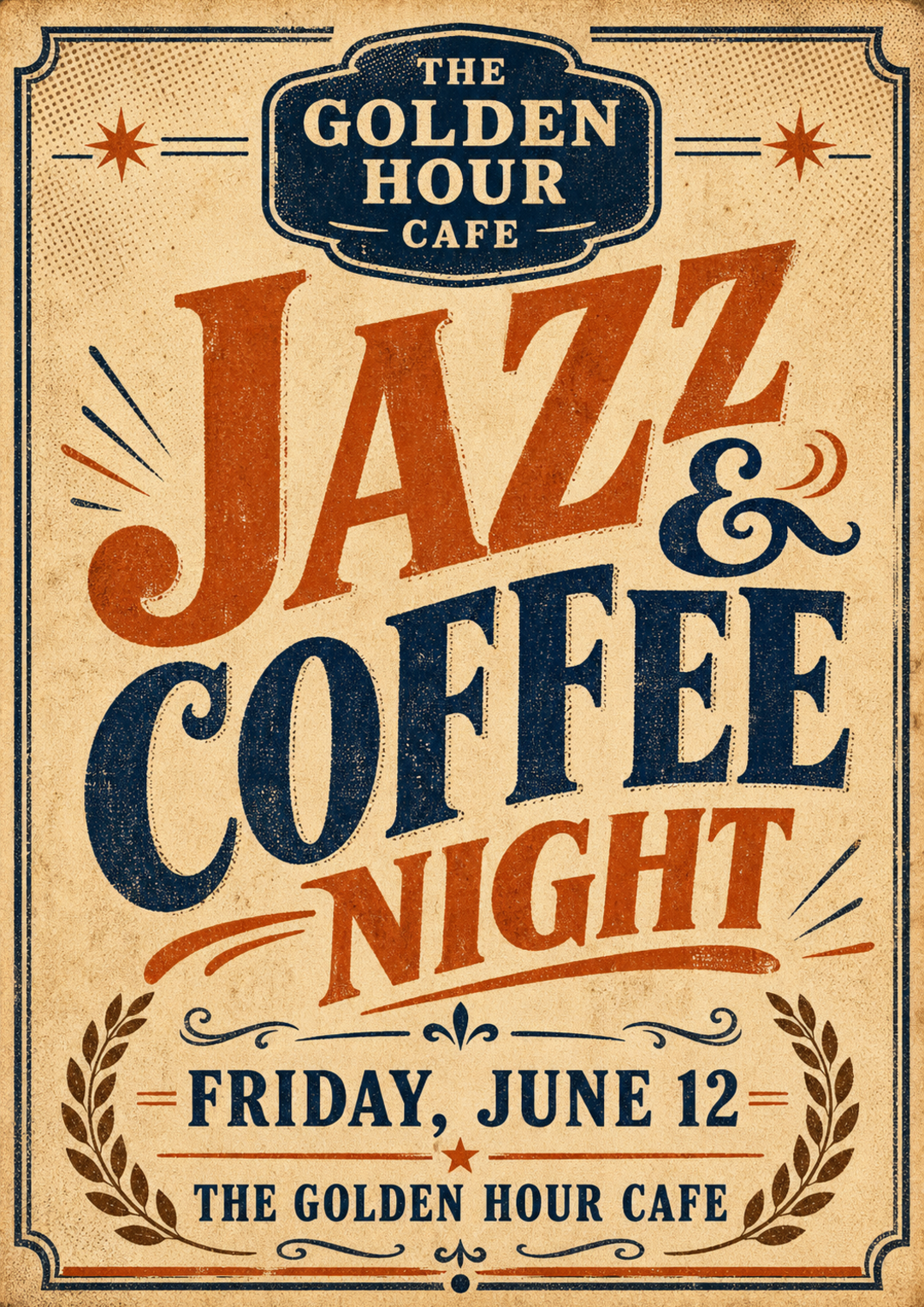
ตัวอย่างผลลัพธ์ที่จะได้
ก่อนเริ่มลงมือปรับพรอมต์ ดูตัวอย่างผลลัพธ์ที่คุณจะได้จริงเพื่อให้แน่ใจว่าพรอมต์นี้ตรงกับงานที่ต้องการ
ปรับให้เข้ากับงานของคุณ
แก้ค่าตัวแปรด้านล่าง พรอมต์ฉบับสมบูรณ์จะอัปเดตอัตโนมัติ พร้อมคัดลอกไปวางใน Claude หรือ ChatGPT ได้ทันที
ชื่อแบรนด์หรือบริษัทของคุณที่ต้องการให้ปรากฏบนโปสเตอร์
ชื่ออีเวนต์ที่ต้องการโปรโมต ใช้ภาษาอังกฤษเพื่อให้ AI จัดการ typography ได้ดีกว่า
วันที่และเวลาของงาน ระบุให้ครบถ้วนตามที่ต้องการให้ปรากฏบนโปสเตอร์
สถานที่จัดงาน ควรระบุชื่อสถานที่และเมือง
ยุคที่ต้องการ เช่น 1920s Art Deco, 1950s Americana, 1960s Mod, 1970s Psychedelic, 1980s Punk
โทนสีที่ต้องการ ระบุ 2-4 สีเป็นภาษาอังกฤษ เพื่อให้ AI ตีความสีได้แม่นยำกว่าชื่อสีภาษาไทย
Brand: The Golden Hour Café
Event name: Jazz & Coffee Night
Date and time: Saturday, 15 June 2026 | 7:00 PM – 11:00 PM
Venue: The Grand Hall, Bangkok
Era style: 1950s Americana
Color palette: warm cream, burnt orange, and deep navy
Design requirements:
- Overall aesthetic: aged distressed printed-on-paper feel with grain and halftone dot texture overlays
- Typography: bold serif or hand-lettered vintage fonts; mix large display type with smaller ornamental supporting text
- Layout hierarchy: brand name at top as a badge or header → event name as the largest central element → date and venue stacked at the bottom
- Decorative elements: ornamental borders, ruled dividers, badges, stars, laurel wreaths, or typographic ornaments authentic to 1950s Americana
- Color: restrict to warm cream, burnt orange, and deep navy with muted, slightly faded aging variations; maximum 4 colors
- Textures: halftone dots, ink bleed edges, paper grain, slightly yellowed or foxed tones
- Format: portrait poster (approximately A3 ratio), compositionally balanced for print
- DO NOT include: modern flat design icons, gradient fills, drop shadows, photography, neon or highly saturated colors
- DO NOT include any human faces or real people
- The design must feel authentically period-correct to 1950s Americana, not a modern pastiche of vintage
เข้าใจเทคนิคที่ซ่อนอยู่
คลิกที่ส่วนไฮไลต์ในพรอมต์เพื่อกระโดดไปดูคำอธิบายเทคนิคแต่ละจุด ใช้ความเข้าใจนี้เพื่อปรับพรอมต์อื่นของคุณเองในภายหลัง
Brand: {{แบรนด์}}
Event name: {{ชื่ออีเวนต์}}
Date and time: {{วันที่และเวลา}}
Venue: {{สถานที่}}
Era style: {{สไตล์ยุค}}1
Color palette: {{สีหลัก}}
Design requirements:
- Overall aesthetic: aged distressed printed-on-paper feel with grain and halftone dot texture overlays
- Typography: bold serif or hand-lettered vintage fonts; mix large display type with smaller ornamental supporting text
- Layout hierarchy: brand name at top as a badge or header → event name as the largest central element → date and venue stacked at the bottom2
- Decorative elements: ornamental borders, ruled dividers, badges, stars, laurel wreaths, or typographic ornaments authentic to {{สไตล์ยุค}}
- Color: restrict to {{สีหลัก}} with muted, slightly faded aging variations; maximum 4 colors5
- Textures: halftone dots, ink bleed edges, paper grain, slightly yellowed or foxed tones4
- Format: portrait poster (approximately A3 ratio), compositionally balanced for print
- DO NOT include: modern flat design icons, gradient fills, drop shadows, photography, neon or highly saturated colors3
- DO NOT include any human faces or real people
- The design must feel authentically period-correct to {{สไตล์ยุค}}, not a modern pastiche of vintage6
แตะส่วนที่ไฮไลต์เพื่อดูคำอธิบายเทคนิคแต่ละจุด · {{ }} คือตัวแปรที่ปรับได้
"Era style: {{สไตล์ยุค}}"
การระบุยุคสมัยที่แน่นอนแทนคำกว้างอย่าง 'vintage' ช่วยให้ AI ดึง visual reference ที่ถูกต้องมาใช้ และทำให้ aesthetic ของภาพสอดคล้องกันในทุกองค์ประกอบ
"Layout hierarchy: brand name at top as a badge or header → event name as the largest central element → date and venue stacked at the bottom"
การกำหนด layout hierarchy ด้วยลำดับที่ชัดเจนทำให้ AI จัดองค์ประกอบภาพตามหลักการออกแบบที่ใช้งานได้จริง ป้องกันการวางข้อมูลอีเวนต์แบบสุ่มที่ทำให้โปสเตอร์อ่านยาก
"DO NOT include: modern flat design icons, gradient fills, drop shadows, photography, neon or highly saturated colors"
การระบุสิ่งที่ไม่ต้องการป้องกัน AI จากการใส่องค์ประกอบสมัยใหม่ที่ทำลายความ authentic ของสไตล์ vintage ซึ่ง AI มักเพิ่มโดยอัตโนมัติหากไม่บอกห้ามไว้
"Textures: halftone dots, ink bleed edges, paper grain, slightly yellowed or foxed tones"
การระบุชื่อ texture technique ด้วยคำศัพท์เฉพาะทางช่วยให้ภาพที่ได้มีความสมจริงตามสไตล์การพิมพ์ยุคเก่า มากกว่าการบอกแค่ 'ให้ดูเก่า' ซึ่ง AI จะตีความกว้างและผลลัพธ์ไม่แน่นอน
"restrict to {{สีหลัก}} with muted, slightly faded aging variations; maximum 4 colors"
การจำกัดจำนวนสีและเพิ่มเงื่อนไข aging เลียนแบบข้อจำกัดของการพิมพ์ยุคเก่าที่ใช้สีน้อย ผลลัพธ์จึงดูเป็น vintage จริงๆ ไม่ใช่แค่ภาพสีสันสวยที่แปะ filter เก่า
"The design must feel authentically period-correct to {{สไตล์ยุค}}, not a modern pastiche of vintage"
การแยกความต่างระหว่าง 'authentically period-correct' กับ 'modern pastiche' บอก AI ถึงมาตรฐานคุณภาพที่ต้องการ ป้องกันผลลัพธ์ที่ดูวินเทจบนผิวแต่ไม่สอดคล้องกันในเชิง design language
เห็นความต่างระหว่างพรอมต์ทั่วไปกับพรอมต์ที่ใช้เทคนิค
คนส่วนใหญ่เริ่มต้นด้วยคำสั่งสั้น ๆ แบบพรอมต์ที่ใช้กันทั่วไป แต่ผลลัพธ์มักไม่ตรงใจและต้องถามซ้ำหลายรอบ พรอมต์แบบที่ใช้เทคนิคข้างต้นช่วยแก้ปัญหานี้
สร้างโปสเตอร์สไตล์วินเทจสำหรับงาน Jazz Night ของร้านกาแฟ
ระบุยุคสมัยที่แน่นอน (เช่น 1950s Americana), กำหนด layout hierarchy ชัดเจน (แบรนด์, ชื่ออีเวนต์, รายละเอียด), ลิสต์ texture techniques เฉพาะเจาะจง (halftone, ink bleed, paper grain), จำกัดจำนวนสีพร้อมเงื่อนไข aging, และใช้ negative constraints เพื่อกันผลลัพธ์แนวโมเดิร์น