สร้างภาพ Abstract Organic Shapes โทน Earth Tone สไตล์ Matisse สำหรับติดผนัง Modern
พรอมต์สำหรับ generate ภาพ abstract wall art แบบ organic shapes สีดิน earth tone นุ่มละมุน อ้างอิงเทคนิค cut-out ของ Henri Matisse เหมาะพิมพ์ติดผนังห้องสไตล์ modern minimal หรือ Japandi
คัดลอกพรอมต์ฉบับมีตัวแปร {{...}} ไปแก้ไขในเครื่องมือของคุณเอง
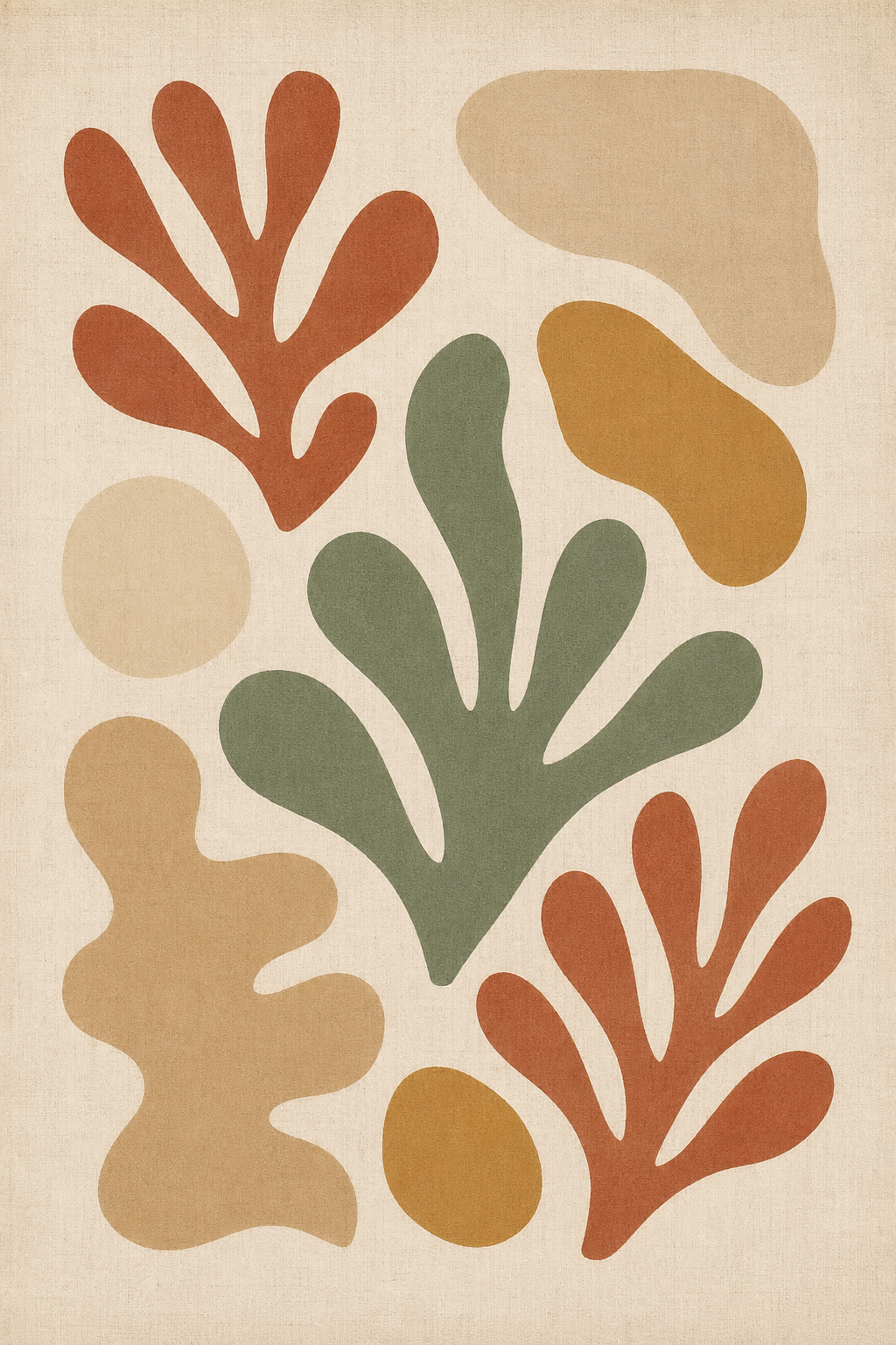
ตัวอย่างผลลัพธ์ที่จะได้
ก่อนเริ่มลงมือปรับพรอมต์ ดูตัวอย่างผลลัพธ์ที่คุณจะได้จริงเพื่อให้แน่ใจว่าพรอมต์นี้ตรงกับงานที่ต้องการ
ปรับให้เข้ากับงานของคุณ
แก้ค่าตัวแปรด้านล่าง พรอมต์ฉบับสมบูรณ์จะอัปเดตอัตโนมัติ พร้อมคัดลอกไปวางใน Claude หรือ ChatGPT ได้ทันที
สีหลักของภาพ เช่น terracotta, dusty rose, ochre, burnt sienna, warm rust
สีเสริมที่ตัดกันแบบนุ่ม เช่น sage green, dusty teal, warm mustard, muted olive
สีพื้นหลัง ควรเป็นโทนอ่อนอุ่น เช่น warm white, cream, pale sand, soft ivory
บรรยากาศของภาพ เช่น calm, playful, serene, warm, melancholic
สัดส่วนภาพตามขนาดกรอบที่จะใช้ เช่น portrait 2:3, landscape 3:2, square 1:1
Color palette: terracotta as the dominant tone, sage green as secondary accent, layered with soft neutrals — warm cream, sandstone, and aged linen. All colors are desaturated earth tones, muted and harmonious, reminiscent of natural clay, dried botanicals, and sun-faded pigment.
Composition: fluid organic forms arranged with generous negative space on a warm off-white linen ground. Shapes overlap gently, no outlines or borders — clean edges only.
Surface: subtle linen canvas grain, slightly aged paper feel. Flat color, no gradients, no shading, no photorealism.
Mood: calm, contemplative, and quietly joyful.
Print format: fine art wall print, portrait 2:3 orientation.
Exclude: text, letterforms, human faces, hard geometric shapes, drop shadows, metallic effects, photographic realism.
เข้าใจเทคนิคที่ซ่อนอยู่
คลิกที่ส่วนไฮไลต์ในพรอมต์เพื่อกระโดดไปดูคำอธิบายเทคนิคแต่ละจุด ใช้ความเข้าใจนี้เพื่อปรับพรอมต์อื่นของคุณเองในภายหลัง
Color palette: {{dominant_color}} as the dominant tone, {{accent_color}} as secondary accent, layered with soft neutrals — warm cream, sandstone, and aged linen. All colors are desaturated earth tones, muted and harmonious, reminiscent of natural clay, dried botanicals, and sun-faded pigment2.
Composition: fluid organic forms arranged with generous negative space3 on a {{background_color}} ground. Shapes overlap gently, no outlines or borders — clean edges only.
Surface: subtle linen canvas grain, slightly aged paper feel5. Flat color, no gradients, no shading, no photorealism4.
Mood: {{mood}}.
Print format: fine art wall print, {{aspect_ratio}} orientation.
Exclude: text, letterforms, human faces, hard geometric shapes, drop shadows, metallic effects, photographic realism6.
แตะส่วนที่ไฮไลต์เพื่อดูคำอธิบายเทคนิคแต่ละจุด · {{ }} คือตัวแปรที่ปรับได้
"Henri Matisse cut-out style ("Jazz" series)"
การอ้างอิงศิลปินและผลงานเฉพาะเจาะจงช่วยให้ AI เข้าใจ aesthetic ที่ต้องการได้ทันที แทนที่จะต้องอธิบายว่า "flat" หรือ "bold" ซึ่งอาจตีความได้หลายทาง
"desaturated earth tones, muted and harmonious, reminiscent of natural clay, dried botanicals, and sun-faded pigment"
การใช้ภาพเปรียบเทียบจากธรรมชาติ เช่น "natural clay" และ "sun-faded pigment" ช่วยกำหนดโทนสีได้ละเอียดกว่าการบอกชื่อสีเพียงอย่างเดียว ทำให้ AI สร้างสีที่มี mood ตรงตามที่ต้องการ
"fluid organic forms arranged with generous negative space"
การระบุ negative space อย่างชัดเจนป้องกันไม่ให้ AI จัด composition แบบแน่นหนาจนเกินไป ซึ่งเป็นปัญหาพบบ่อยในการ generate ภาพ abstract
"Flat color, no gradients, no shading, no photorealism"
Image generation model มักใส่ shading และ gradient โดยอัตโนมัติ การระบุ negative constraint บนเทคนิค rendering ช่วยรักษาความเป็น flat graphic ที่เป็นเอกลักษณ์ของสไตล์ Matisse
"subtle linen canvas grain, slightly aged paper feel"
การกำหนด texture ที่เฉพาะเจาะจงให้ภาพดูเป็น fine art print ไม่ใช่ภาพ digital ที่ดูเรียบจนเกินไป ซึ่งช่วยให้ผลลัพธ์เหมาะสำหรับพิมพ์ติดผนังมากขึ้น
"Exclude: text, letterforms, human faces, hard geometric shapes, drop shadows, metallic effects, photographic realism"
การรวม negative constraints ไว้เป็นรายการท้ายพรอมต์ช่วยปิดกั้นผลลัพธ์ที่ไม่พึงประสงค์ทั้งหมดในคราวเดียว เป็นเทคนิคสำคัญสำหรับ image generation ที่มักเพิ่มองค์ประกอบโดยไม่ได้สั่ง
เห็นความต่างระหว่างพรอมต์ทั่วไปกับพรอมต์ที่ใช้เทคนิค
คนส่วนใหญ่เริ่มต้นด้วยคำสั่งสั้น ๆ แบบพรอมต์ที่ใช้กันทั่วไป แต่ผลลัพธ์มักไม่ตรงใจและต้องถามซ้ำหลายรอบ พรอมต์แบบที่ใช้เทคนิคข้างต้นช่วยแก้ปัญหานี้
วาด abstract art สีน้ำตาลๆ ติดผนัง
- ระบุศิลปินและผลงานอ้างอิงที่เฉพาะเจาะจง (Matisse, Jazz series)\n- กำหนด color palette พร้อมภาพเปรียบเทียบจากธรรมชาติ\n- อธิบาย composition และ negative space อย่างชัดเจน\n- ระบุ surface texture และ finish (flat color, linen grain)\n- ปิดกั้นด้วย negative constraint list ครอบคลุม